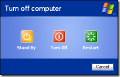
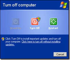
OK Windows Vista users. You certainly have enough familiarity to the vista-style start menu, ain't you?
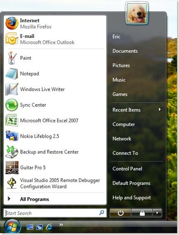
So what if I ask you an easy enough question, what's the function of the button located right next to the search box?
What happens when I click on it?
Do really think about it before you continue reading the rest.
Is it used for turning off your computer? or is it used to putting your computer in stand-by mode?
Let's ask for the tooltip by pointing the cursor over the button.

Seems it is the "stand by" button, which, although virtually turning off your computer, there's actually power (electricity) running through it for quick resuming.
But Wait! I came across this occasionally!

It does read "shuts down", which means it's going to completely turning off your computer!
What causes the different behaviour?
You may already notice, the icons from the above 2 pictures are slightly different. When windows found some updates for your computer, it will (by default) automatically download it and asks you to install them. Isn't it nice?
The problem is however, putting two different behaviour into the same position. If I am a novice computer user, I will be confused and get mad easily by the behaviour. "Hey, last night when I click on the button with a small circle next to the search box, my computer turns off completely. But today when i click on the same button (the button on the same position, to be accurate), my computer does not turn off, the power LED keeps blinking!"
The UI designer may blame the users for not looking at the tooltip, and ignoring the different graphics on the button. He maybe right. He has told you what will happen when you click on it but you choose to ignore it. You choose to perform tasks the way you used to. So if something goes wrong, the UI designer is not the one to be blamed.
But is it a good design?
Surely not.
First of all, usability principle #1. Users don't read
While saying a 19-words sentences "Saves your session and puts...... quickly resume working.", why not just label the icon as a merely 2-words, "Stand By" ?
Secondly, I doubt if the UI designer knows anything about "Conceptual Models". We have our own way to interpret "how things in our surrounding environment work". As an example to illustrate, suppose you take the Bus Route #5 everyday to work. You know really well that when you see a no. "5" on the bus, you know where it's going without looking at its destination.

What if one day the destination of Route #5 changed? To make things more complicated, What if the destination of Route #5 is reverted back to its original few days later?
Maybe it's going to be some degree of disaster.
People keeps saying how Windows Vista outweighed Windows XP. Surely XP is almost 10 years old and Windows Vista, as the successor of WinXP, offers us a beautiful and fancy operating system. However in many aspect, I still think WinXP is much more better than Vista, in terms of UI designs and usability. Take the "Shutdown vs Standby" cases as an example, I think the WinXP counterpart is much more easier to follow and causes much less confusion.